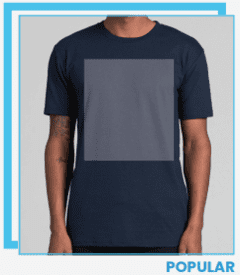
Branding is essential for giving individuals in an organization a unique identity, and where logos are placed on uniforms matters for visibility and professionalism. Let's explore how different positions on uniforms are branded:
The choice of branding elements depends on the message, look, and functionality desired for each uniform position. Carefully selecting where logos, contact details, and other graphics go allows organizations to design uniforms that are both cohesive and impactful, reinforcing their brand identity while being practical.

This position commonly features the company's primary logo. It is the focal point, offering a clean and recognizable representation of the brand. In addition to the logo, it may include the company name or a tagline for added brand messaging.

The front chest of a uniform serves as a central canvas for branding, featuring the primary logo on the left side for instant recognition. This logo, designed to represent the organization's core identity, is complemented by the company name and, in some cases, a tagline.

The back of the uniform serves as a prominent canvas for the primary logo. It may also feature additional information like the company's contact number or website. This provides a convenient reference for those who may approach from behind and wish to make contact.

In contrast to the left side, the right side often accommodates secondary elements such as sponsor logos or logos of brother/sister brands within the organization. Some organizations choose to personalize this space by printing individual names or numbers, adding a touch of individuality to the uniform.

The sleeve is an excellent space for dynamic branding. It often features a streamlined version of the company logo, and in some cases, it may include additional elements like a tagline or a graphic element that emphasizes the brand's identity. The left sleeve is also a popular place for embroidered patches.

Similar to the left sleeve, the right sleeve typically mirrors the branding elements featured on the left for consistency. It may showcase a smaller version of the primary logo or a complementary graphic element. This symmetry enhances the overall polished and put-together appearance of the uniform.
Never Miss A
Sale!
SPECIAL OFFERS DIRECT TO YOUR INBOX
Copyright @ 2023 Lightning promotions All Right Reserved

